Company: Careology * Role: Product designer * Product: Website & branding
Careology, a health-tech startup dedicated to cancer management, needed a new website as its existing one was outdated and failed to effectively convey its mission.
The objective was to create a modern, accessible and engaging website, aligned with Careology’s values while enhancing accessibility. The challenge was to simplify complex information and interactions without losing clinical depth. As a product designer with Poppins Agency, I led the project, spearheading user research, crafting the user experience and reshaping the brand identity.
The initial research highlighted how the website’s navigation was overly complex, cluttered and buried critical information. Moreover, the existing brand was underdeveloped and inconsistent, lacking maturity.
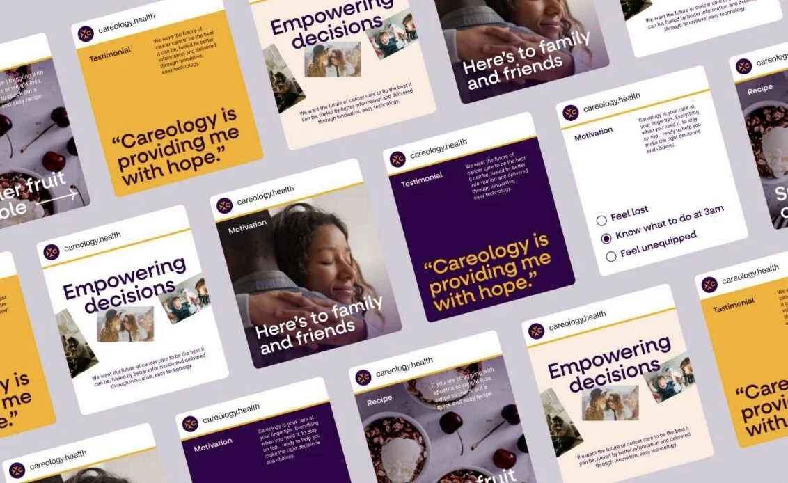
With no defined brand guidelines, I repurposed and streamlined the existing material: redefining the brand’s colour palette, typography, and visual style to make them more accessible and reflective of the brand’s empathy.
I recommended a softer, warmer and more welcoming colour palette (shifting some of the existing shades), creating a cohesive and professional visual identity, to ensure consistency moving forward.

a new website for a new phase
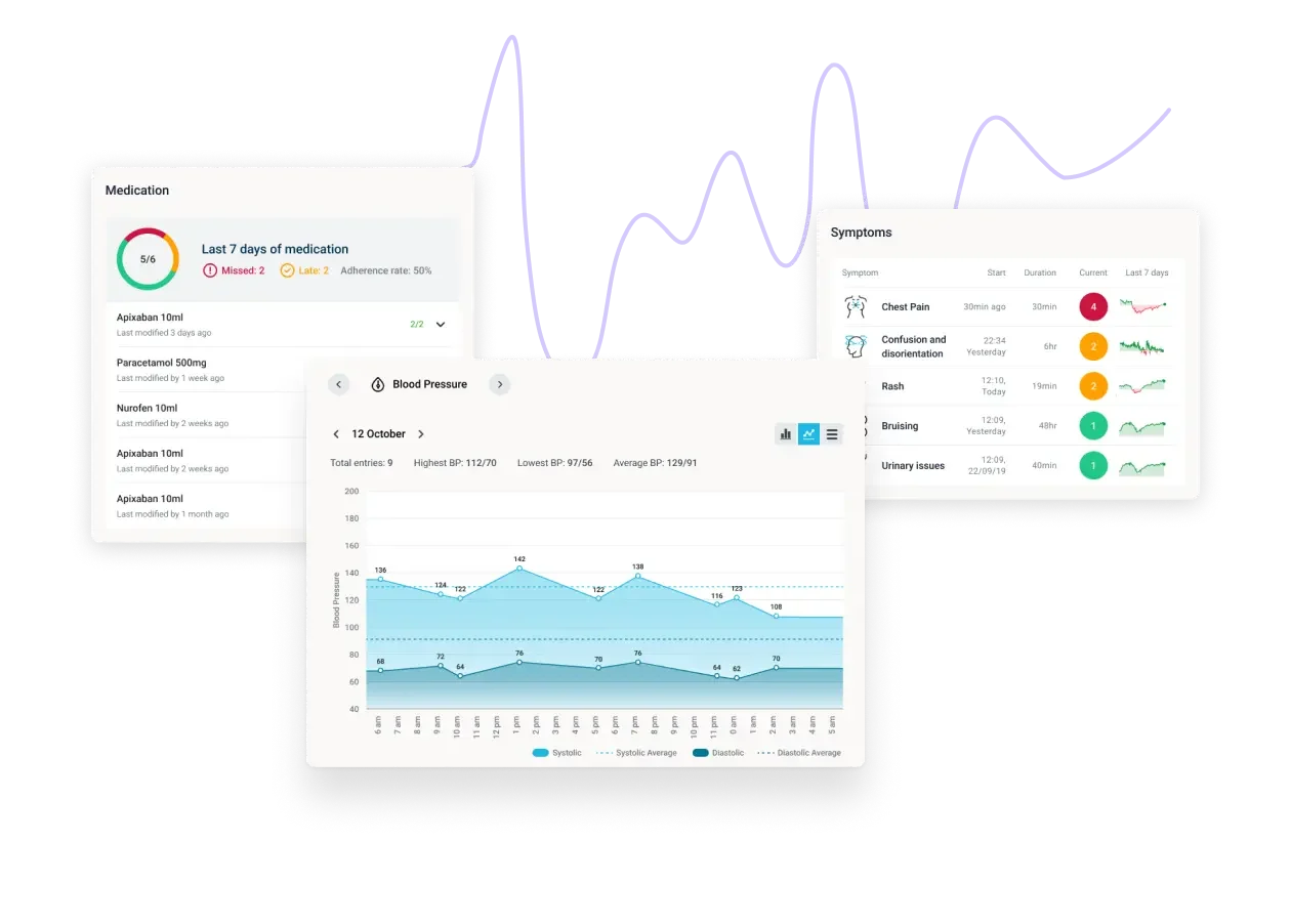
The redesigned website is a modern, responsive B2B platform that clearly communicates Careology’s mission while appealing to business stakeholders and individuals seeking support. The new design simplifies navigation for a more seamless experience whilst delivering an empathetic, user-friendly interface fit for its new enterprise audiences.
This website aligns with the refined brand identity, presenting a cohesive visual and tonal message; It perfectly positions Careology for its next phase of growth, combining cutting-edge design with a deep understanding of its stakeholders: patients, healthcare professionals and caregivers at the heart of their mission.
a brighter future for digital cancer care
Supporting Careology to launch its next phase has been empowering. From redefining their brand through a more focused creative direction to crafting a website fit to appeal to their new audience and stakeholders. This project has opened the door for further collaboration between the startup and Poppins agency. To this day, Careology has a new and improved branding that works beautifully on their website.
This was made possible by my work on repurposing their existing branding, all about decluttering their visual identity into a more mature vision, with the addition of a shade of marigold yellow for a warmer and more positive outlook. These improvements led to a more cohesive and accessible experience, supporting higher engagement and more consistent usage across the platform. This work reinforced the importance of empathy and clarity in healthcare design. By focusing on the emotional as well as functional needs of users.